What Actually Goes Into Building a Squarespace Website?
One of the things I genuinely love about Squarespace is that it gives people the confidence to have a go at building their own website.
And lots of my clients have done exactly that before they come to me. They’ve signed up to Squarespace, chosen a template, added their photographs and copy and managed to get something online. Sometimes they’ve lived with that website quite happily for a few years.
Then something changes.
The business grows up a bit. Their work gets better. Their prices increase. They become clearer about who they want to work with. And suddenly the website that once felt perfectly fine starts to feel as though it belongs to an earlier version of the business.
That’s often the point when I hear from them.
They don’t necessarily need a website because the old one is broken. More often, it just isn’t doing them justice anymore. It doesn’t quite have the polish they want, the message has become muddled, or they’ve reached that slightly frustrating stage where they know what they want it to feel like but can’t quite make it happen themselves.
That’s often the point when they start looking for a Squarespace designer who can take what they’ve already built and bring it up to the level of the business it represents.
And that’s where the difference between using Squarespace and actually designing a polished and professional website becomes really apparent.
Because yes, I can sit down at my computer and build things in Squarespace fairly quickly. I’ve been doing it for years. But the clicking and dragging is the easy bit.
The real work happens in all the thinking around it.
In this guide, I talk about:
Before I design anything, I need to understand the business
The first part of designing a Squarespace website isn’t thinking about the colours and fonts. They matter, of course, but first I need to understand what we’re actually trying to achieve.
Where is the business now? Where does the client want it to go? What does the website need to do that the current one isn’t doing?
If there’s already a website, I’ll have a good look at that before I touch anything. I want to know whether it’s already bringing in traffic, which pages people are finding and what they’re searching for when they arrive.
There may be parts of that old website quietly doing a really good job, even if the client doesn’t particularly like the way they look anymore, and I don’t want to throw those away without understanding them first.
That’s especially important with SEO. A redesign can cause a bit of movement in Google anyway, so if something is already working, I want to know what it is before we start changing URLs, structure or copy.
Then I look at the bigger question: what is this website actually here to do?
For one client, it might need to bring in new enquiries through Google. For another, most of their work comes through referrals and they simply need somewhere beautiful and reassuring to send people. A photographer needs room to show their work properly. A therapist needs to build trust very quickly. A consultant might need to explain a service that isn’t immediately obvious.
There isn’t one formula I can apply to every business.
I need to understand the bones first. Once I know those, the design decisions become much easier.
Then I need to understand how the brand should feel
This is where things start to become a little more visual.
My clients complete a brand and SEO questionnaire before we begin, and a lot of what I’m looking for is simply a sense of them. Who are their clients? What matters to those people? What problems are they solving? What do they want someone to feel when they land on the site?
I often ask: how do you want someone to feel by the time they reach the bottom of your homepage?
That answer tells me quite a lot.
What I’m really trying to understand is the feeling that fits the business. Should it feel polished and understated, warm and approachable, bold and confident, soft and calm? Once I’ve got a sense of that, it starts to inform everything else - the typography, the spacing, the imagery, the colours and the overall pace of the page.
I also ask clients to show me websites they love. They don’t have to be competitors and, actually, sometimes it’s more useful if they aren’t. I’m trying to understand what they’re naturally drawn to: the amount of space, the typography, the imagery, whether something feels luxurious or relaxed or modern.
By the time I’ve read through all of that and looked at the references they’ve sent me, I usually have a pretty good feel for what will suit them.
Most people come to me because they already like my design style and have looked through my portfolio. My work tends to be clean, modern, minimal and unfussy, with plenty of space, so I’m not trying to reinvent myself as a designer every Monday morning. It’s more about taking the personality of that particular business and interpreting it through my own design eye.
And, thankfully, that instinct tends to be pretty accurate. When I show a client the first few sections of their homepage, very often the reaction is simply, “Yes. That really feels like me.”
That’s always a lovely moment.
For me, the imagery comes first
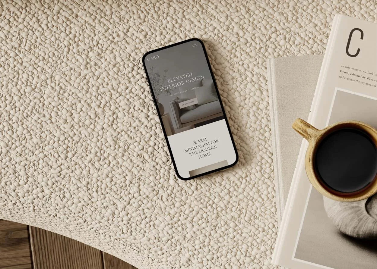
Good photography makes an enormous difference to a website, particularly for the kinds of businesses I work with.
Many of my clients are solopreneurs or very small businesses, which means the person behind the business is a big part of what somebody is buying into. If you’re a therapist, coach, photographer, consultant or interior designer, people want to get a sense of you as well as what you offer.
A really good brand shoot gives me so much more to work with than one nice headshot.
I love the little detail images: hands, books, objects, corners of a room, someone working, movement, texture. Those are often the photographs that make a website feel beautifully personal rather than generic.
If a client doesn’t have that kind of imagery, then we may need to fill the gaps with stock photography or carefully created visuals. And this is one of those things that sounds much quicker than it is.
Finding an image is easy. Finding a collection of images that all feel as though they belong together, work with the client’s existing photographs, suit the brand tone and values and don’t instantly scream “stock library” is something else entirely.
I can lose a surprising amount of time disappearing down stock photography rabbit holes, which is why I have to put some boundaries around it in my own projects. But good image curation really matters. You can have five lovely images individually and still find that they simply don’t work together.
That judgement is part of the design.
I need the copy before I start designing
I’m quite strict about this one!
I need the copy before I design the website.
When somebody books a project with me, I give them structured Google Docs for each page so they know what I need from them and have some guidance about what to write. Some people are naturally good at writing about their business. Others find it excruciating.
Most people are using AI in some form now and it can absolutely be useful, but I still think there’s a real place for a good copywriter. They can often see an angle in your business that you simply can’t see when you’re standing too close to it.
Copywriting isn’t technically part of my website packages, but if somebody gives me copy that really isn’t doing them any favours, I’m not going to blindly paste it into a beautiful design and carry on. I’ll suggest changes, tweak things where appropriate or flag something that I think needs another look.
Because copy and design aren't two completely separate jobs.
I need to know what I’m laying out. How much information is there? What is most important? What needs to be said first? What can be tucked away further down the page? Where does somebody need reassurance, and where do we want them to take action?
I’m not a fan of huge walls of text either. People need to be able to scan a website fairly quickly and understand what you do without feeling as though they’ve just been assigned homework.
That doesn’t mean cutting all the useful information. Sometimes an accordion is perfect for FAQs or additional detail. It lets us include genuinely helpful copy without making the page feel overwhelming.
For me, good website copy has two audiences: the person reading it and the search engine trying to understand what the page is about.
The person comes first.
SEO has to be part of the thinking at the beginning
If a client wants the website to bring in enquiries through Google or AI search, I need to know that before I start designing it.
SEO isn't something I particularly like bolting onto the end of a website after everything else has been decided.
I want to know what the main service is, what people are actually searching for and which pages need to talk about which things. If there’s an existing site, I also want to know whether any of those pages are already doing well so we can be careful about what we change.
The structure of a site, the page copy, headings, URLs and internal links all help Google understand what a business does. Then, yes, there are the slightly less exciting jobs later on: SEO page titles, descriptions, alt text and all the rest.
But the important bit starts much earlier.
At the same time, I never want a website to sound as though it’s been written for Google. There is nothing elegant about shoehorning the same phrase into a page six times because somebody told you that’s what SEO means.
The site still needs to sound natural. It needs to sound like the business behind it. And it needs to be enjoyable for an actual person to read.
I get the homepage right first
Once I’ve got the strategy, copy, imagery, brand direction and SEO in my head, then I start designing.
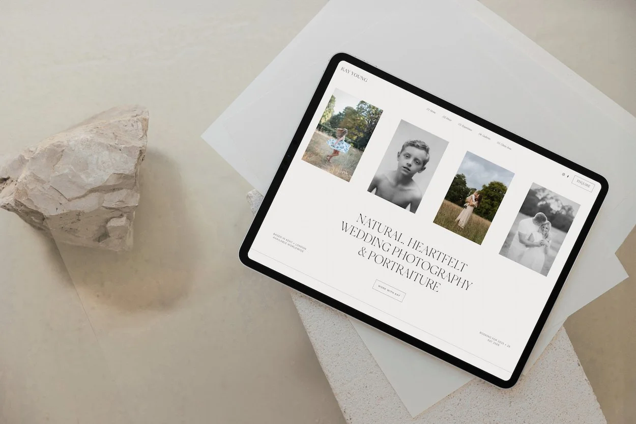
I always get the homepage right first.
That’s where I establish the typography, colours, button styles, spacing, calls to action and the general visual rhythm of the site. I want that first page to feel completely resolved before I start racing off and building everything else.
Then I do the mobile layout for the homepage, making sure everything is spaced beautifully. I’m a huge fan of centring the design on mobile rather than having elements constantly switching between left-aligned and centred. It’s amazing what a difference that can make - the site immediately feels smarter, calmer and much more enjoyable to move through.
Sometimes that means making small CSS tweaks too, particularly where certain elements need behaving differently on mobile. Contact form fields and accordion blocks, for example, often need a little extra attention to make sure everything feels as considered on a phone as it does on desktop.
I don’t like building an entire desktop website and leaving mobile until the very end. Once the homepage is working properly across desktop and mobile, I know I have a visual system that works.
I can then save some of those sections and use them as a starting point elsewhere on the site. They’ll be adapted, of course (I don’t want every page to look identical), but I’m building from something that already feels finished rather than starting from scratch on every page.
That’s where a lot of the consistency comes from.
When a website is well designed, you don’t necessarily notice the spacing, typography or button styles individually. You just notice that everything feels calm and cohesive and as though it belongs together.
That’s what I’m aiming for.
Sometimes something just doesn’t feel right
This is probably one of the hardest bits of design to explain, because it’s where experience and instinct come in.
Sometimes I’ll put something together and think, No. That just doesn’t feel right.
An image that looked perfect in isolation might suddenly feel wrong beside another one. A section may be too heavy. The page might need more air. The balance may be off. Sometimes the chosen font or a tone of colour isn’t communicating the brand perfectly and needs a rethink.
Sometimes you have to go down one road to realise you don't want to go down that road at all.
That isn't wasted time. That is the design process.
And I think this is the part people sometimes underestimate when they’re considering what a professional website costs.
You’re not really paying somebody for how long it takes them to lay out images and text in Squarespace. You’re paying for the judgement behind all of those individual decisions. The eye, the experience and the ability to know when something is nearly right but not quite.
If you’re at that stage, I’ve written a separate guide to how much a Squarespace website costs in the UK and what you’re actually paying for.
Squarespace itself as a platform can be technically relatively easy to use - yes.
But building a Squarespace website and creating an overall experience that feels completely cohesive, communicates the right message and gives somebody that little feeling of, yes, this is the person I want to work with, takes a lot more thought.

Why I ask for everything a week before we begin
The smoothest website projects are always the ones where everything is ready.
I ask my clients to have their copy, imagery and content with me seven days before I begin designing, and that deadline isn't there simply because I enjoy being organised.
The start of my process is entirely holistic. I’m absorbing everything at once: the business, the copy, the photos, the audience, the references and what the client wants the website to achieve.
That’s what allows me to form a really clear picture of where I think the design should go.
It becomes much harder if everything arrives piecemeal. Half the copy on Monday, some new images on Wednesday and then, halfway through the build, a completely different idea because someone has spoken to their friend’s brother who works in marketing.
Please don't do that to your designer.
Do the thinking first. Gather everything together. Decide what you want to say. Get the imagery sorted and then hand us the whole picture.
I can’t do my best work as a designer piecemeal.
That preparation is exactly what makes my Website in a Week process work so well. If everything is ready and the direction is clear, I can immerse myself properly in one business rather than spending weeks dipping in and out of it.
A website isn’t finished just because it looks finished
There’s a fairly unglamorous stage at the end of every website build where I basically cross all the Ts.
URLs need checking and, on a redesign, redirects may need setting up. SEO page titles and descriptions need adding, along with alt text.
Contact forms need connecting and testing. Social links need to go to the right places. The favicon needs setting. Business information needs adding behind the scenes. Navigation and footer links need checking, as do privacy policies and terms.
Then there’s the domain connection, followed by another round of checks once everything is actually live.
I submit the forms myself to make sure the messages arrive. I click the buttons. I look at the website on desktop, tablet and mobile. I check every link goes to where it should.
None of this is the glamorous bit but it’s the difference between a website that looks finished and one that actually is.
So, is it worth paying someone to build you a Squarespace website?
You absolutely can build a Squarespace website yourself. That accessibility is one of the things I love about the platform. But being able to use the software and being able to design a really good website are two different skills.
A DIY website quite often announces itself as DIY, even if the person looking at it couldn't tell you exactly why. Perhaps the images don't quite work together, there are big blocks of copy, the calls to action are weak or the spacing is a little inconsistent. Very often it’s not one terrible decision. It’s lots of small decisions that simply haven't quite come together as a whole.
And we’re all exposed to incredibly sophisticated branding every single day now. We know instinctively when something feels polished and professional, just as we know when something feels a little homemade.
That matters enormously for a small business.
If you’re still deciding whether to keep going yourself or bring in a professional, I’ve written a separate guide to hiring a Squarespace designer or DIYing your website.
If somebody is choosing a therapist, an interior designer, a wedding photographer or a consultant, they’re looking for reassurance before they ever make contact. They want to know that you understand them. They want to trust you. They want to feel confident that they're about to spend their money with someone who knows what they're doing.
Your website starts answering those questions before you’ve ever spoken to them.
I see people invest so much in becoming excellent at what they do. Training, qualifications, cameras, equipment, studios, courses, years of experience. Then sometimes the website is treated as the bit where they should spend as little as possible.
But for many businesses, your website is your shop window. It might be the first proper encounter a potential client has with you.
And when they’re looking at your business alongside two or three others, a website that feels considered, clear and professional can absolutely be the difference between them closing the tab and sending you an enquiry.
Squarespace makes it relatively easy to build a website. It’s the experience, thought and judgement behind it that elevate it into something that builds trust - and makes people want to reach out
If your website has started to feel like it belongs to an earlier version of your business, I’d be very happy to help you bring it up to where you are now. You can find out more about working with me as a Squarespace designer.